Laura Geller Balance 'n Brighten Comparisons: Porcelain, Light and Regular
8:00 AM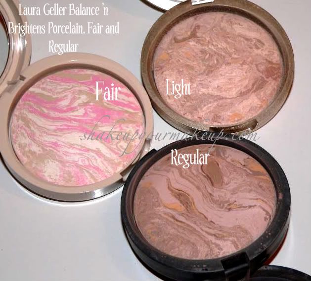
**Note: I clearly had not had my coffee when I labeled these: it should be Porcelain, Light and Regular**
They say a picture is worth a thousand words, so I figured I'd give it a whirl! I found the three different shades of Laura Geller I've picked up over the years, and wanted to do a side-by-side swatch. Porcelain is definitely a world different than Fair and Regular, but this should at least give you an idea as to how much.
Like I mentioned in my earlier posts, Porcelain is really more focused on the pink and ivory to help cancel out all the red discoloration us porcelain girls can get. There is obviously the beige coloring in there as well, helping mute out the pinks, but overall, this is a much paler color. In the swatches below, you can hardly see it against my skintone, where the other two clearly stand out. Porcelain also lacks the yellow undertones, where the Light and Regular definitely embrace those. I'd say the difference between Light and Regular is the deeper tones found in Regular.
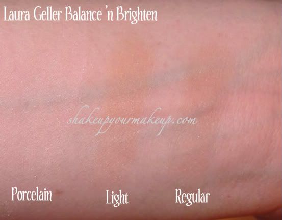
Hopefully this helps so you can really see the difference between the three. I really think the first picture does lay it out well.


0 comments